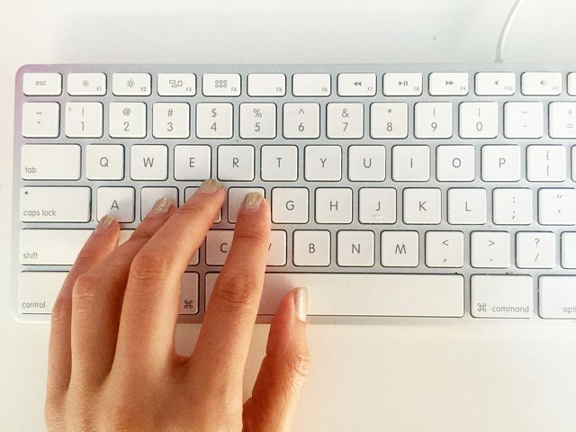
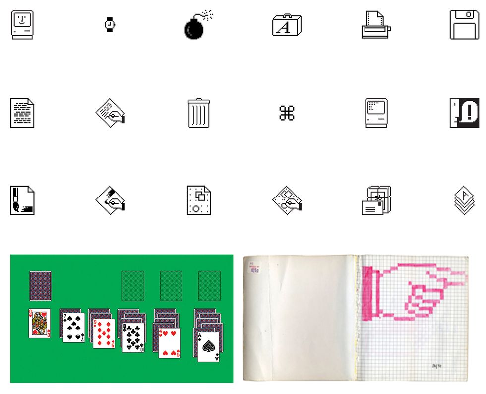
If you happen to be reading this on a Mac, take a look at the command key — it was designed by Susan Kare back in the '80s, a time when computer screens were often black spaces with blinking cursors and the mouse was an exciting feature. The ⌘ symbol's longevity is a testament to Kare's prowess as a designer. She joined Apple in 1982 to design icons and fonts for one of the first personal computers with a graphic interface, the Macintosh. Instead of typing extensive commands to do even the simplest functions, the Macintosh featured a desktop in the way we think of it today, with representational icons and easy navigation.
As the so-called "computer for the rest of us," the Macintosh was meant to be intuitive and user-friendly. To this end, Kare designed the "Happy Mac," a smiling computer that greeted users when the machine booted up. (Slightly less happily, she also created the "bomb" that appeared when the system crashed.) Her iterations of the trash can and folders that appeared on the desktop became Apple signatures. Her first typeface, Chicago, lasted through myriad interfaces, from the Macintosh all the way to the fourth generation of the iPod.
She's since gone on to create thousands of icons for hundreds of companies. For Windows 3, she designed the solitaire game; for Facebook, she created the original Gifts. Kare now works at Pinterest, where she's a product-design lead. IRL, she's whip-smart and wry. Earlier this month, Kare explained how to design an icon that stands the test of time, gave the scoop on working with a young Steve Jobs, and revealed the symbols she's still trying to get right.
Alex Ronan: How did you became the Mac icon and font designer?
Susan Kare: I got a PhD in art history at NYU, and then I went to the Fine Arts Museums of San Francisco on a fellowship. It became immediately clear to me that I wasn't a great match for curatorial work because I was always envious of the artists we visited.
I had remained friendly with a high-school friend who was working at Apple as a programmer. He approached me about helping with some graphics and showed me an early Macintosh prototype. To prepare for the interview, I read typography books at the library and drew a few rudimentary bitmap icons and letterforms with a marker in a graph-paper sketchbook. It was a very brief interview, but I got the job and I started work almost immediately.
AR: Were you a computer whiz?
SK: No, I had zero formal experience. Computers were essentially foreign to me, so it was a bit overwhelming to get up to speed, but the Mac group was small and welcoming. Also, I did have limited experience designing for grids from working on craft projects such as tiled ashtrays and cross-stitch embroidery kits.
AR: What was your first project?
SK: The very first project I took on was designing the system font for Macintosh that became known as Chicago (its original name was Elefont, because it was a heavier weight than the existing text fonts). I branched out quickly into icons and other typefaces.
AR: What was it like working at Apple in the early '80s?
SK: The environment was clubby and friendly; there was a Ping-Pong table in the lounge area in the middle of the software group's cubicles, and Steve Jobs [co-founder, chairman, and CEO of Apple, Inc.] would often drop by at the end of the workday to see what was new and play a little Ping-Pong — he was more enthusiastic than skillful.
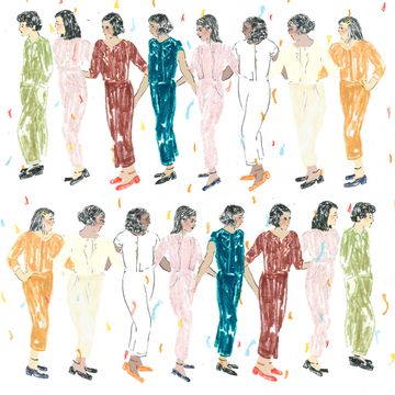
The original Macintosh group had many women in key roles: CFO Debi Coleman, controller Susan Kelly Barnes, engineering documentation manager Linda Wilkin, international marketing manager Joanna Hoffman, product marketing manager Barbara Koalkin, technical writer Caroline Rose, and documentation writers Lynnea Johnson, Hasmig Seropian, and Carol Kaehler, programmer Rony Seebok, circuit-board designer Collette Askeland, and software librarian Patti Kenyon.
AR: I had no idea there were so many women back then. Looking at pictures from that era, it's remarkable how young Jobs was. What was it like working with him then?
SK: It was always really fun to show Steve something new because, if he liked it, he was so joyful. Sometimes he brought in visual material to share that had caught his eye, such as graphics from Memphis, a 1980s Italian design group founded by Ettore Sottsass. And it's no secret that he had a shiny Bösendorfer grand piano and BMW motorcycle in the lobby of the Macintosh building so that everyone could be inspired by examples of design excellence.
AR: What makes an icon easier or harder to design?
SK: Generally, it's a lot easier to represent concrete nouns than abstract concepts, so "document" is easier to design than "undo." I try to focus on developing a memorable symbol for a concept, as opposed to a detailed illustration, to give icons a better chance of longevity. For a "fill" tool in the paint program that changed a defined area to black, white, or a pattern, I designed a can of pouring paint. Because our mission was to be accessible and "friendly," I sometimes took a humorous route.
AR: How did humor come into play in your work at Apple?
SK: Early on, I was asked to design a symbol for total system failure, something that the programmers and engineers thought would rarely happen, so it was highly unlikely the icon would be seen much at all. Probably cartoons inspired that icon — a bomb with a lit fuse — and of course I wouldn't have been so irreverent if I had known so many people would see it!
Right after the first Mac shipped in January 1984, some software-team members were gathered in our office and a call was forwarded to us from Apple's main number. Unfortunately, an early Macintosh user's system had crashed, the dialog box with the bomb was visible, and the woman on the phone was worried that her computer might blow up.
AK: Growing up, one of my first computer experiences was fighting with my brothers over whose turn it was to play the solitaire you designed for Windows. I recently saw that you've turned that design into an actual deck of cards, and all those memories came flooding back. I know people have tattoos of your designs and buy prints for their homes and offices. Did you ever expect people would develop such an emotional attachment to your designs?
SK: I loved designing those cards because I'm addicted to solitaire — it's one of the first card games I remember my mother teaching me to play — and it was a great pixel challenge.
At the time, I really was focused on solving the design problem at hand, not speculating about the future. Of course it's gratifying to see some of the icon concepts in use 30 years later, and I'm flattered that people have good memories and associations with them.
AR: Even though computers are a modern invention, you have, as you mentioned, an art-history background. How has that influenced your work?
SK: When you study art history, you learn that there is very little that is completely new, and in many ways digital art is no different. I love to derive inspiration from all types of images: mosaics, hieroglyphics, petroglyphs, woven patterns in textiles, and needlework. There is a lot of very good "pixel" design work before the 20th century, like a 1760 sampler by Elizabeth Laidman that looks like a bitmap font.
I don't use work from the past as a literal guide; rather, those artifacts reinforce a view that simple images can communicate with wide audiences over time. Icon design is like solving a puzzle, trying to marry an image and idea that, ideally, will be easy for people to understand and remember.
AR: Are there icons that you still find hard to get right even after designing for decades?
SK: I'm still trying to come up with something good for concepts that defy easy visualization, such as "categories" or "followers." I never stop trying to think of a really good icon for "idea" that doesn't involve a light bulb.
This interview has been edited and condensed.
Alex Ronan is a writer living in Berlin.
