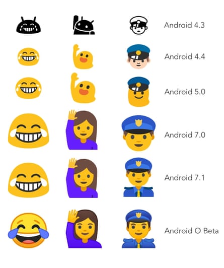
The best emojis on the market are no more: Google’s weird blobs are being retired in favour of more conventional circular yellow faces.
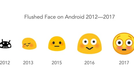
First introduced in 2013 with Android 4.4, the blobs have been a divisive feature of the company’s operating system. Some love them for their unique spin on otherwise indistinguishable emojis, while others hate the potential for miscommunication they introduce when speaking across multiple platforms.
That was particularly true between 2014 and 2016, when not just smilies, but all human figures, were updated to incorporate the amorphous blob. The dancing emoji – a glamorous flamenco dancer in implementations that take their cue from Apple – was a fairly unflattering blob with a rose between its teeth in Android Lollipop.
In 2016, the blobs were redesigned, losing some of their blobbiness and becoming more gumdrop-shaped, after Unicode (the body that oversees emoji design) introduced genders and skin tones for human emojis. That also saw the beginning of the end for the blobs, as the human figures were made more human, leaving only smilies amorphously-shaped and yellow.
But the latest version of Android, O, which is expected to hit phones this autumn as Android 8.0, sees a total redesign of every emoji, dropping the blobs altogether. The new versions follow a similar evolution to that introduced by Apple in iOS 10 last year, with a higher a level of detail in the designs – and an adoption of the standard round yellow faces for smilies.
Google’s Rachel Been explained the changes in a blogpost: “We spent a long, long time making sure that we addressed cross-platform emotional consistency. Because one of our main goals with the redesign was to avoid confusion or miscommunication across platforms, we wanted to assure the user that when they sent an emoji to a friend, the message was clearly communicated regardless of whether they are on iOS, Windows, Samsung, or any other platform.”
According to Emojipedia’s Jeremy Burge, the redesign has been in the works for almost a year. He said: “For those used to the old Android designs, some of these emojis will remain familiar, while others could take some getting used to. It was clear the old set had several layers of history baked in: slightly different colours between emojis, some appeared larger while others were smaller.”

The full list of redesigned emoji can be found on Emojipedia.
Google also promisers Android users will have the ability to update phones with newer emoji without installing new versions of the operating system. That would allow devices that don’t receive rapid updates, such as cheaper Android phones and tablets, to continue to see all the emoji available for their platform.
Not every Android device is affected by the emoji change: a number of manufacturers, including Samsung and LG, implement their own emojis, replacing Google’s. Those may not be changed by the update.
One last thing to not worry about: the peach emoji still looks like a butt and the gun still looks like a handgun, not a water pistol. Google’s not going to make the same mistakes as Apple any time soon.
